New Zine
New Zine
Back in January, I delivered a brief talk on my desktop publishing research at the New Directions in Graphic Design History Symposium. Aggie Toppins organized the symposium, held at Washington University in St. Louis, as part of the launch for her excellent book Thinking Through Graphic Design History. There was a wealth of great presenters and I was honored to share time with some old grad school friends. My talk was titled “What You See Is What You Get.” It is now June and I finally had time to assemble the words and pictures into a zine.
You can order the 24-page zine from my shop for $5+shipping. This first edition was printed at the Center for Cartoon Studies. The cover is white cardstock and the interior is yellow text weight paper. A friend said that paging through the zine feels like cracking an egg.
As Tamar Adler so aptly writes:
“A good egg is only worth it if you know all it’s good for.”
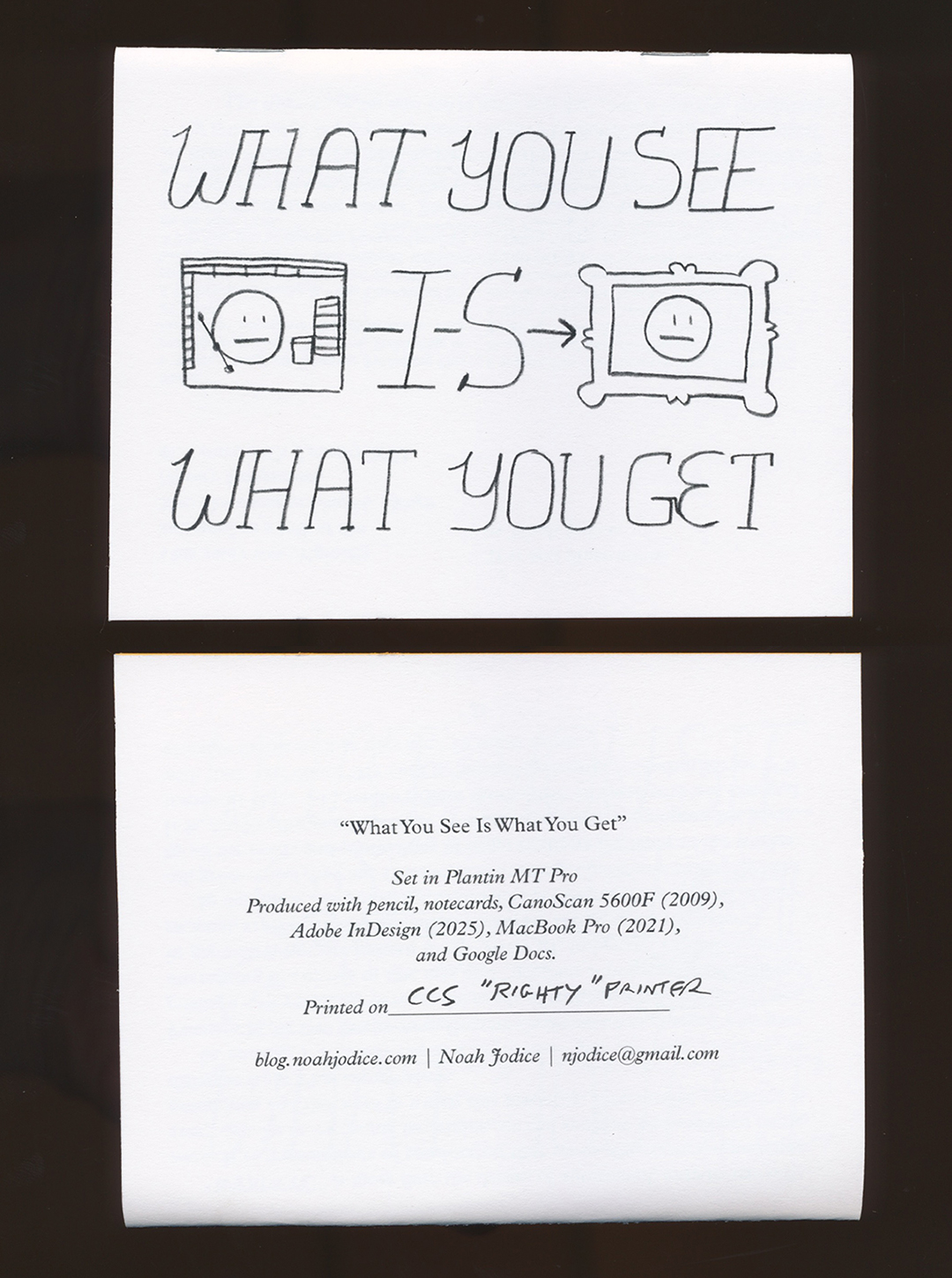
She suggests an omelette with deep friend oysters and cold remoulade sauce. Suggestions for the zine-based equivalent are welcome. As for my egg, the pictures were drawn with pencil on notecards and scanned into the computer. The words take us through a WYSIWYG détournement. The progression is:
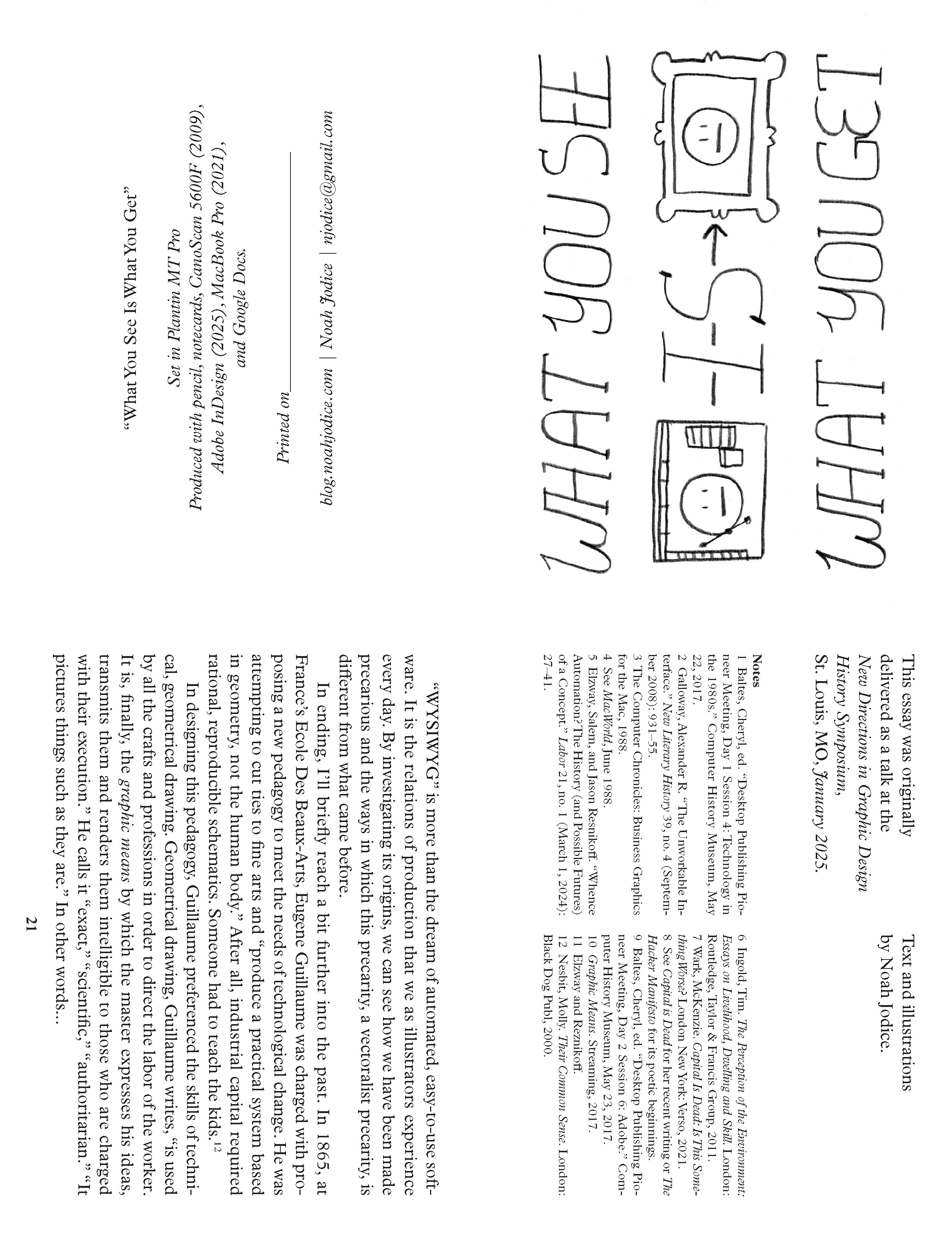
What You See is What You Get –>
What You Get is What You See –>
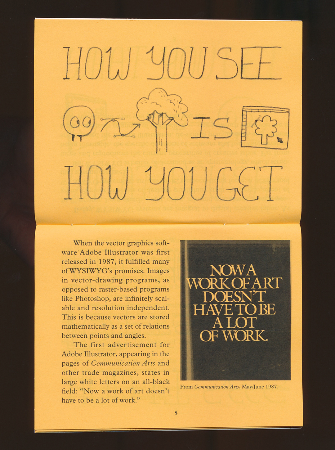
How You See is How You Get –>
How It Sees is How You See –>
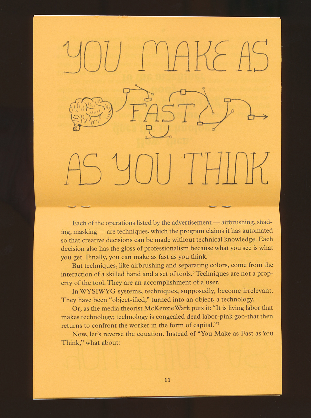
You Make as Fast as You Think –>
You Think as Fast as You Make –>
How You Get is How It Gets –>
What You Get is What I Get –>
What You See is What You Get
We start with the relationship between a design software user (you) and the output of the software. We unfold the relationship between user, software, and computer. We shift between modes of making/thinking and thinking/making. We expand from one designer to the relationship between designers. We return, at the end, to the self-reinforcing teleology: What You See is What You Get.
Here’s the symposium abstract if you need further convincing:
Within the nascent desktop publishing industry of the late 1980’s, the phrase “What You See Is What You Get” became an epistemological north star. WYSIWYG, as it was often abbreviated, drove the development, implementation, and use of digital software packages, computer hardware, and printers. For designers and illustrators, the goal was a creative process where what you “saw” and manipulated on screen would be what you “got” when you printed. Today, WYSIWYG systems are commonplace, with graphical user interfaces and software that accurately reproduce or even surpass the resolution and accuracy of print.
This presentation questions how the teleological nature of WYSIWYG reinforces visual biases and hegemonic ways of seeing. When is “what you get” no longer derived from your own creativity, but from the inscribed preferences of the software? Through détournement and wordplay, this presentation reworks WYSIWYG in order to understand the forces of production within.
The proliferation of WYSIWYG systems set the stage for present-day corporate enclosure of the creative industry, the deskilling of practitioners, and the congealing of creative expertise into applications powered by “Artificial Intelligence.” By introducing productive friction between “what we see” and “what we get,” creative laborers can begin to uncover the relationship of production between themselves and the software they use every day.
Research draws upon online archival resources, trade publications, oral accounts, and materials from RIT’s Cary Graphic Arts Collection and WashU’s Kranzberg Art & Architecture Library.
This past weekend, I brought copies of the zine with me to table at the Toronto Comic Arts Festival. They sold suprisingly well and I had some great chats with other cartoonists about design tools. TCAF was held at the Mattamy Athletic Center instead of their usual spot at the public library. My table was on the ice rink where the Maple Leafs used to play. Thankfully, no tables were toppled by a rogue zamboni.
Printing Notes
This is the second zine I’ve printed at quarter-letter size. It’s a nice propoportion; the closest thing, maybe, to looking at a slide presentation and hearing the words. But, if you want to maximize pages while minimizing paper use, it takes a bit of custom pagination. To get the “cracked egg” effect without paper waste, I had to use “work-and-turn” paginaition. The cover sheet prints the front and back covers and their versos. By flipping and rotating those pages across the sheet, you can get two copies out of one sheet of paper (see the plates below).
Sheet one, front and verso. Notice that the verso is the same as the front rotated 180 degrees. When printed duplex and cut along a vertical center line, you end up with two copies of the cover sheet.
InDesign’s “Print Booklet” function will not do this for you. Spectrolite, a great application for paginating and setting up Risograph color plates, can automatically “work-and-turn” one sheet. But, for this zine I needed two “work-and-turn” sheets (the cover plates on one and pgs. 9-12 on the other). So, I exported individual pages as TIFs from InDesign, then built a new pagination doc, placing and rotating the pages as needed to assemble my letter-size plates. The whole process required some bad math, many test prints, and a few hastily constructed dummy booklets.
If anyone wants a longer explanation of the why/how, send me an email. I’ll have a new post up soon about the writer John McPhee’s non-WYSIWYG text editing process.